

Put Down the Paint Chips. We’ve Got You.
Choosing paint is deceptively simple. It's just color on a wall, right? And yet it's the decision that clients agonize over most, the one that results in the most 2am "wait, should we have gone darker?" wake-up moments and the one that — when done well — makes everything else in a room click into place.
At Wellhouse & Co, we think about paint the way a chef thinks about salt. It's not the flashiest ingredient, but get it wrong and nothing else saves you. And paint is a relatively inexpensive way to change the feel of an entire space!
Color shapes how a room feels before a single piece of furniture arrives. It responds to morning light differently than afternoon light. It impacts all your other materials like your stone, your woodwork, your metals. It can make a small room feel like a jewel box or a large room feel cavernous and cold.
So we treat it with the seriousness it deserves — which means a lot of samples taped to walls, a lot of squinting, and occasionally telling a client that the color they fell in love with on Pinterest simply won't work in their north-facing dining room. (That's what you're paying us for.).
Here's a behind-the-scenes look at the colors our team returns to again and again — and more importantly, why they keep working.
1. Warm Whites That Feel Just Right
White sounds easy. It is not.
Walk into any paint store and you will find approximately four hundred whites, each with a name designed to make you feel something (Morning Fog! Whisper! Timeless!) and zero guidance on which one won't make your kitchen look like a hospital waiting room.
The wrong white is worse than no white at all. Too cool and it feels sterile. Too yellow and it feels dated. Too bright and every scuff and shadow announces itself. We’ve made plenty of these mistakes ourselves and in fact, our first every project had to be completely repainted because the white we choose was too yellow. A lesson learned the hard way!
The ones we return to — Sherwin-Williams Alabaster, Benjamin Moore Westhighland White, and Sherwin Willams Greek Villa — earn their place because they behave. They reflect light without bouncing it aggressively around the room, shift warmly throughout the day, and know their job: let the stone, woodwork, art, and lighting take center stage.
The right white should feel like an exhale. If you're second-guessing it on the sample card, trust that instinct.
2. Soft Neutrals That Do the Quiet Work
If warm whites are the backdrop, soft neutrals are the layers that make a home feel like it was put together by someone with an actual plan - which is especially useful when you’re updating your home one room at a time.
SW Natural Tan is one we reach for often on trim and doors. When white feels overly crisp, Natural Tan can add just enough warmth to feel intentional without drawing attention to itself.
For warmth with a hint of gray, we choose SW City Loft. That subtle greige undertone is great if you're transitioning your home’s color palette from gray or white to warmer tones - City Loft can act as the bridge to a new direction.
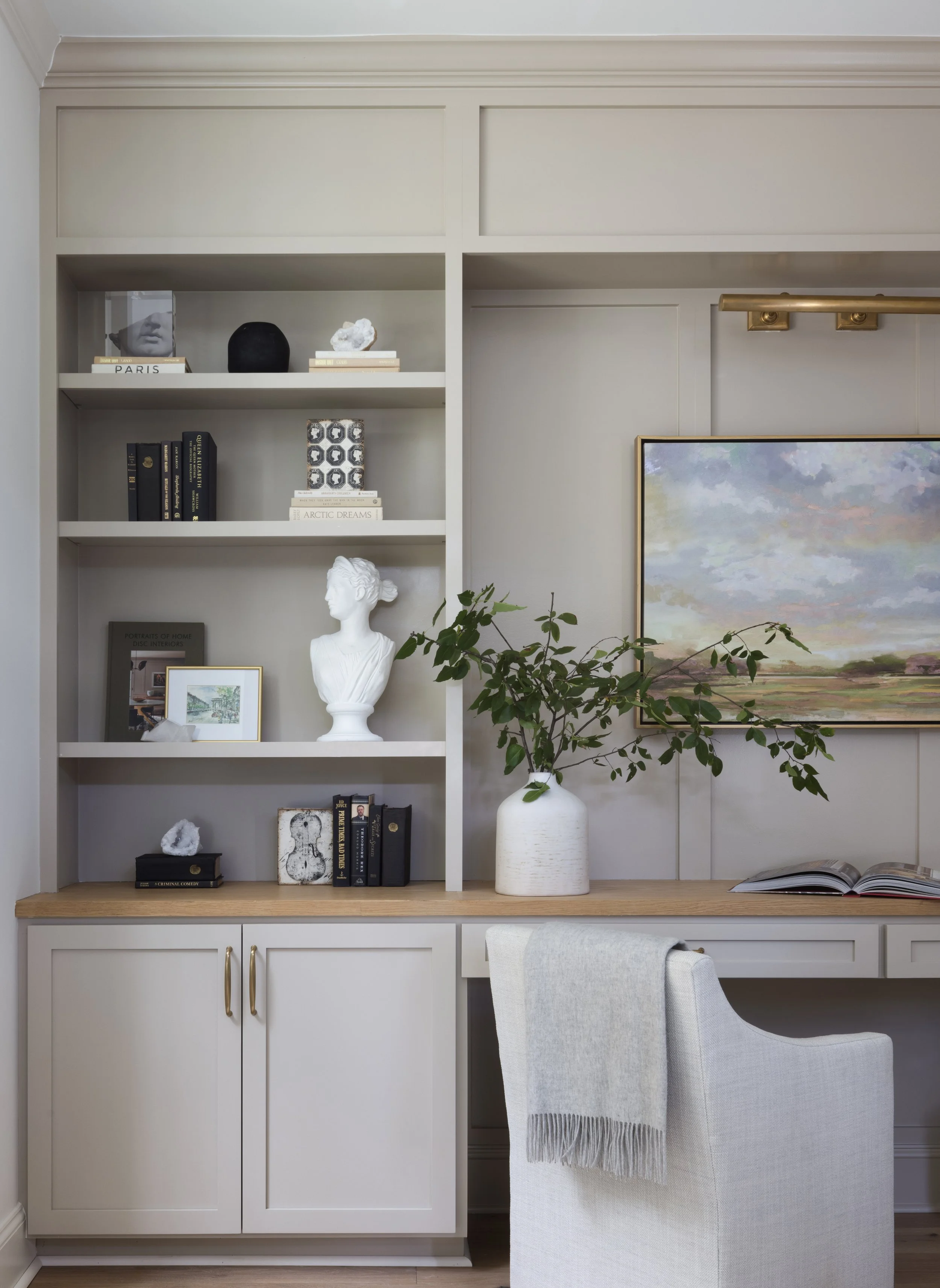
We also love SW Shiitake. Similar to SW Natural Tan but slightly darker, it’s one of our favorite neutrals for cabinetry. It looks beautiful with brass and wood tones, and created a soft back drop in this she-library we designed.
3. Commit to Color. Here’s How.
A well-placed deep tone is what gives a home its personality. The key word being well-placed. We're not suggesting you paint your living room black and call it bold. We're talking about the rooms where committing to a rich, muted color transforms the entire experience of being in that space.
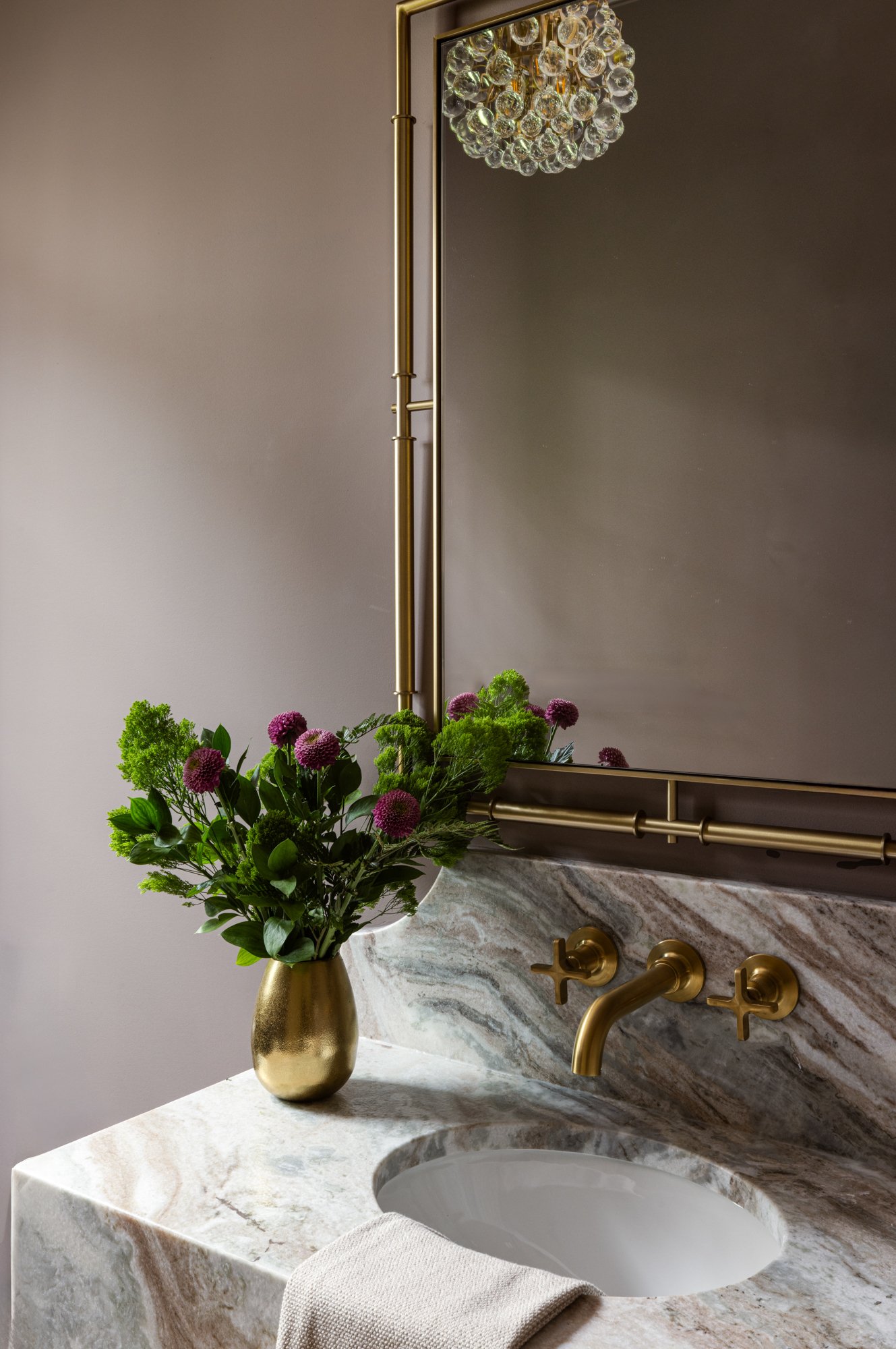
Take SW Plum Brown in a powder room below. We paired it with Fantasy Brown Marble and a brass wall mounted faucet so we could gently WOW guests. That's the jewel box effect in action — a small room that feels like a destination rather than an afterthought.
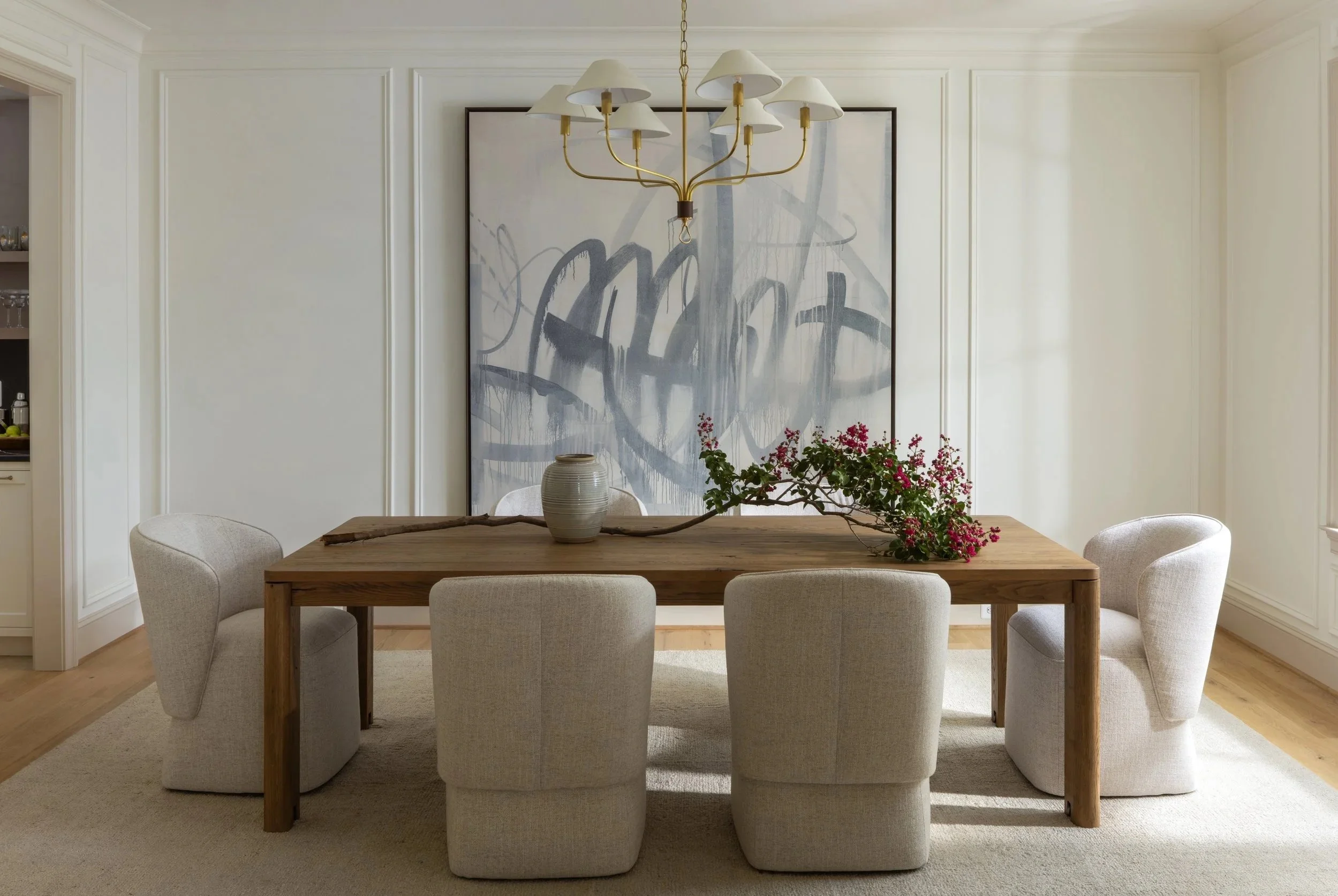
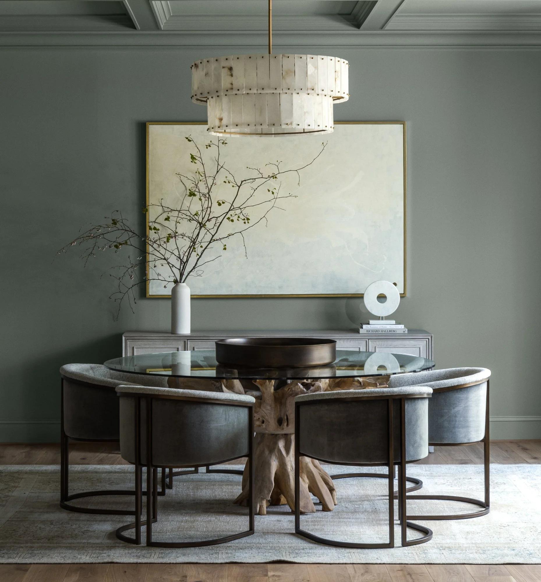
In the dining room below, SW Rare Gray has a dramatic impact paired with the alabaster chandelier, the oversized artwork and the organic dining table with velvet chairs.
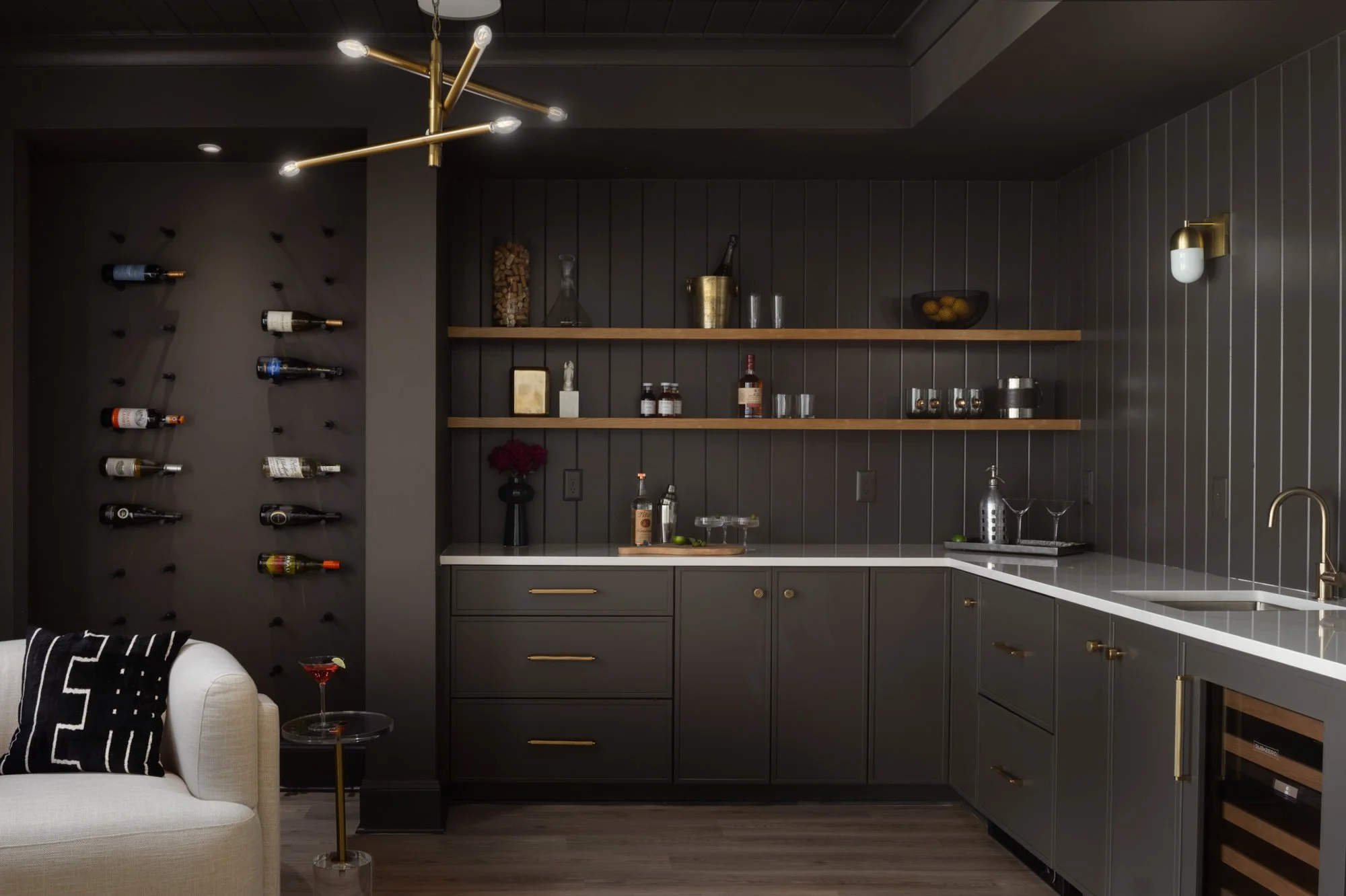
And then there's the basement bar in SW Urbane Bronze (below), where we drenched the cabinetry and the wall in the same tone. There is something about committing fully to a dark, sophisticated tone in a space meant for entertaining that just works every time!
The secret to making bold color feel intentional rather than overwhelming is color drenching — painting the walls, trim, and ceiling the same color so the room becomes one cohesive, enveloping experience. But here's what most people get wrong when they try it: they treat every surface the same. Don't.
The sheen is everything.
Walls: eggshell — enough sheen to be wipeable, soft enough to not show every imperfection
Trim: semi-gloss — it catches the light differently and subtly defines the architecture without breaking the color
Ceiling: flat — pulls the eye up and adds depth without any glare
That variation in sheen is what gives a color drenched room its richness and dimension. It's also what separates a designer's version from a DIY attempt that falls a little flat. Same color, three different finishes, completely different result.
4. Color and Light: Why Sampling is Non-Negotiable.
Paint never exists in isolation. The same color can feel completely different depending on how much natural light a room gets, the undertones in your flooring and cabinetry, and whether your home leans traditional or modern. This is why we sample obsessively and why we'd gently discourage anyone from making a final color decision based on a paint chip the size of a Post-it note.
A good example: BM Classic Gray. In an existing home with smaller windows and warmer, more traditional finishes it's beautiful — soft, layered, quietly sophisticated. We loved it. Then we tried it in a new construction home with large black windows, abundant natural light, and modern finishes. Suddenly it pulled yellow in a way that felt anything but classic. Same color, completely different result.
That's not a flaw in the color. That's just how light works.
A few sampling tips we swear by:
Order or paint large swatches — at least 12x12 inches. Tiny chips lie.
Live with it for at least 48 hours and check it morning, midday and evening
Look at it with your lights on too — artificial light changes everything after dark
The goal is never just a color you love in isolation. It's a color that loves your home back.
The Right Color Changes Everything.
Paint is the smallest investment in a room and somehow the one that matters most. Get it right and everything else — the furniture, the materials, the light — seems to exhale. Get it wrong and no amount of beautiful sourcing will fully save you.
It doesn't have to be stressful though. With the right guidance and a commitment to sampling, color becomes one of the most joyful parts of the process.
At Wellhouse & Co, every decision comes back to the same idea — design that restores. Spaces that feel like an exhale at the end of a long day.
If you're staring down a wall of paint chips and second guessing everything, we'd love to help. Browse our portfolio at www.wellhouseandco.com and follow along @wellhouseandco for color inspiration and the occasional strong opinion about whites.
Because life is too short for colors that ALMOST work!